River Hog Flapjacks

Introducing River Hog Flapjacks!  This has been the most fun part of my school experience so far — this making up of companies. For my second package design assignment, I decided to do a pancake mix. In Canada, sometimes a pancake breakfast is called a “lumberjack breakfast”, and so I decided to incorporate a lumberjack concept. In my research, I found that “river hog” is a term for loggers that use river water to transport wood, and I thought that sounded like a great name. I wanted to design something hip and sophisticated, something unique that would stand apart from the competitors on the grocery shelves. I opted for a dark color for the box and a modern typeface combined with a more old-fashioned looking script typeface. I even cooked the pancakes and took the photo myself! This was my first time photographing food for a label, and I have to say I was pretty impressed with the results. Thanks to my teacher Tom who challenged me to find the button on my computer that makes things look good.

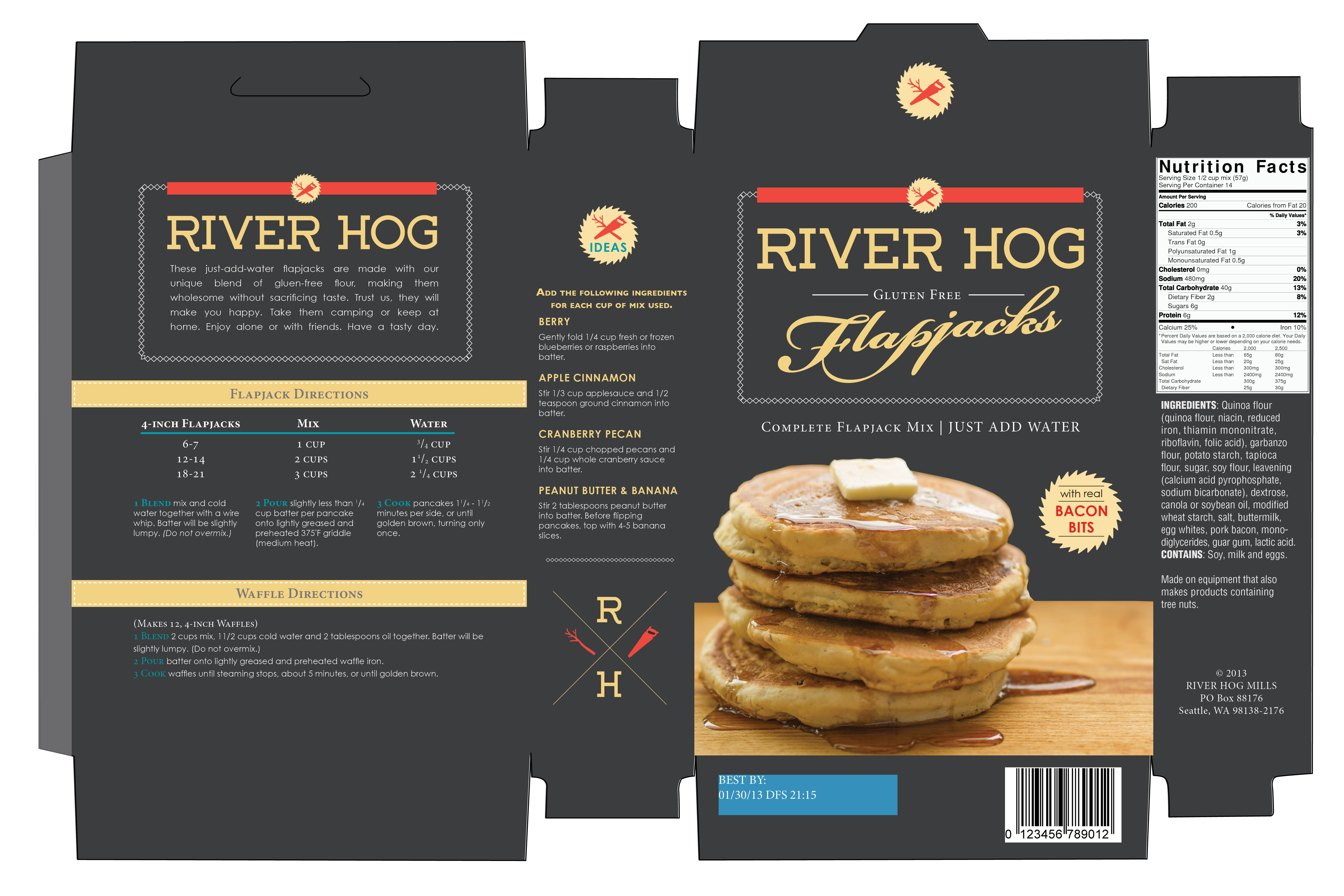
River_Hog_Flapjacks_Box


Space Between Poster

Space Between


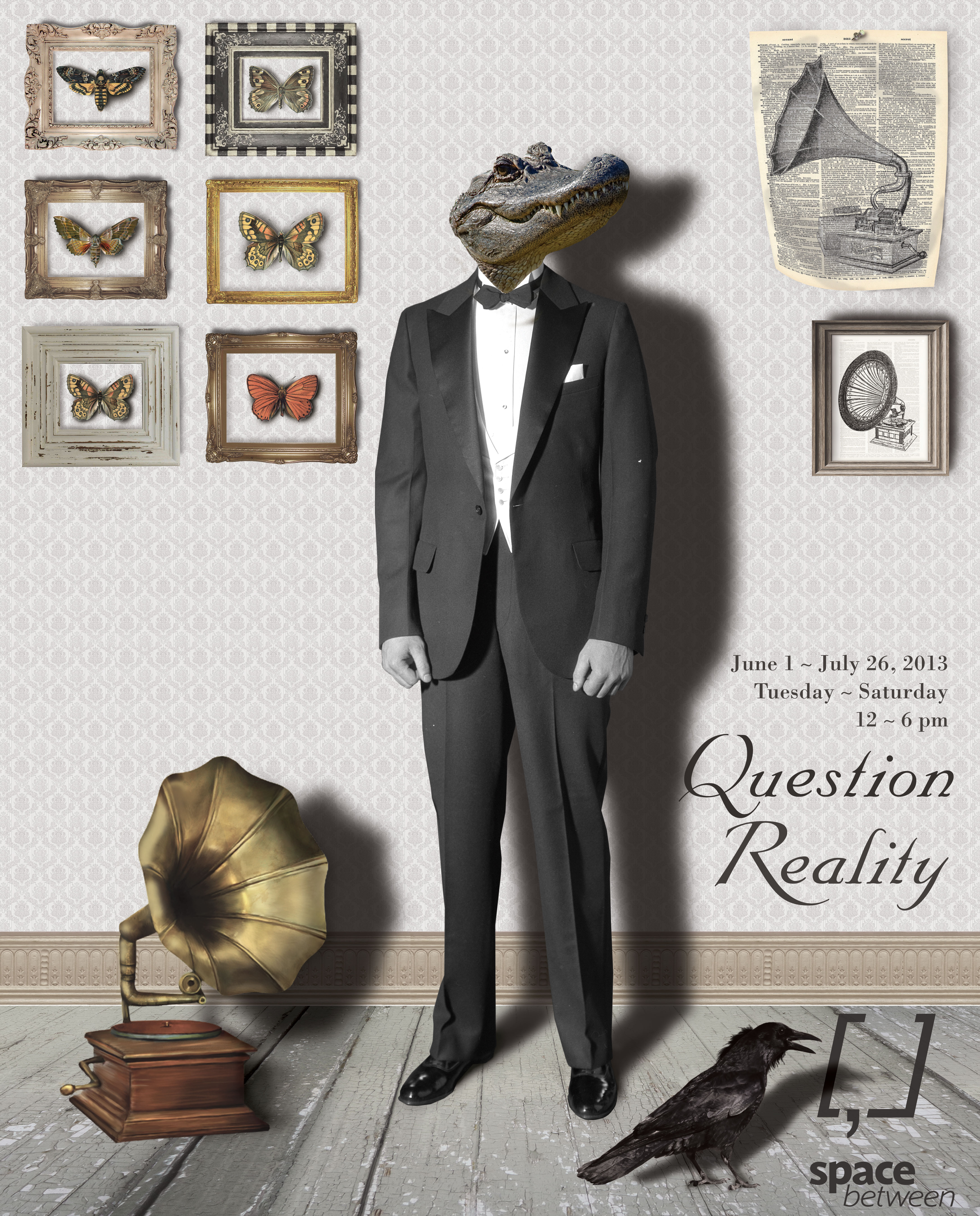
This is my latest project for my Graphic Productions class.  It was a poster for an exhibition called “Question Reality” for an art gallery called Space Between.  This was totally the coolest and most fun thing by far I have ever made on a computer, and I had so much fun making it.  I even bought a really cool book on how to tell stories with photoshop compositions, and I can’t wait to make some more.

Whoop whoop!


Diamond Horseshoe Cocktail Sauce

Our first task for our package design class was to pick a jar or round container and come up with a product name.  I chose cocktail sauce, because I knew it would be challenging.  In my research for my creative brief, I discovered that the American version of cocktail sauce was invented during prohibition and it is suggested that cocktail dishes (shrimp cocktail, fruit cocktail, etc.) were invented as a creative way to make use of unused stemware. For my concept, I decided upon 1930s supper clubs, which was the birthplace of cocktail sauce.

And so gave birth to Diamond Horseshoe Cocktail Sauce, named after a well-known supper club of the 1930s.

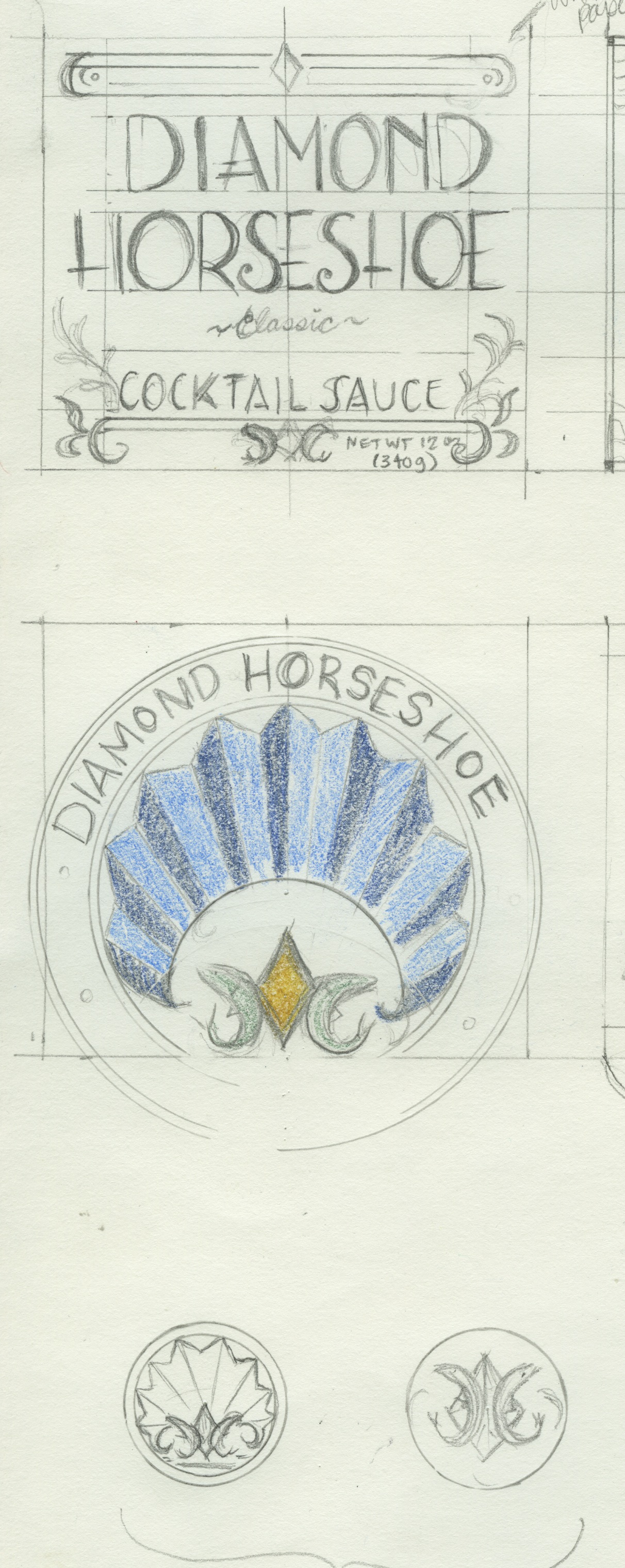
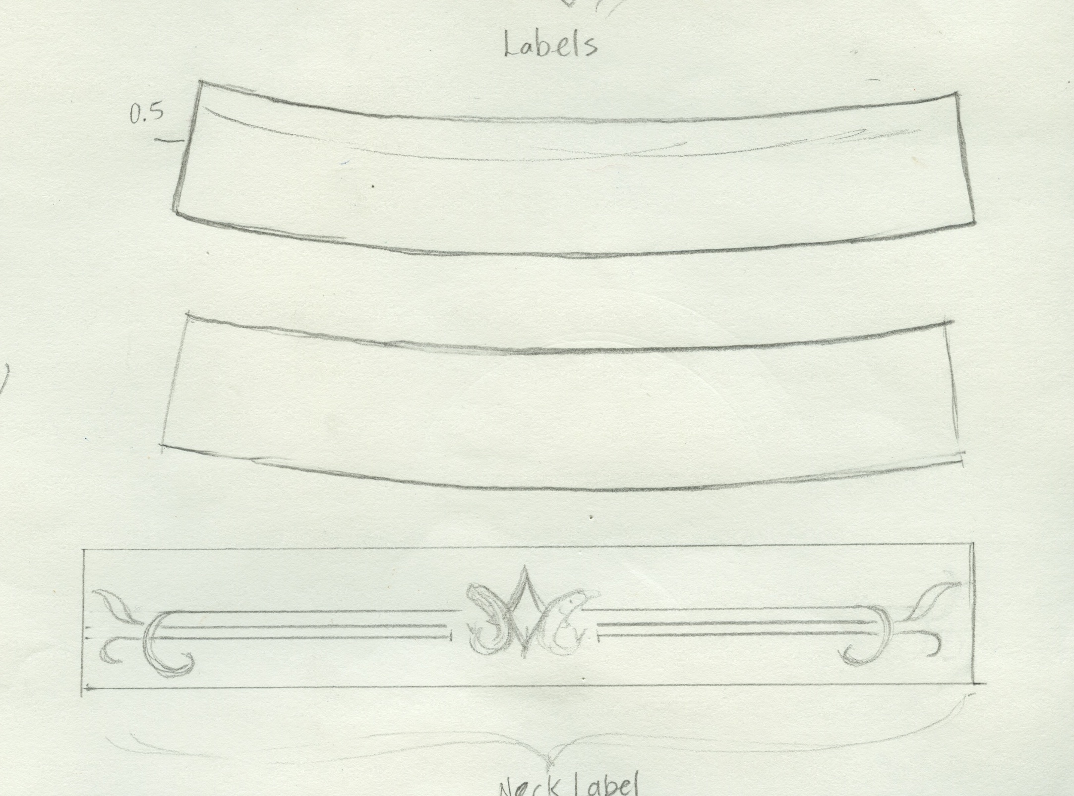
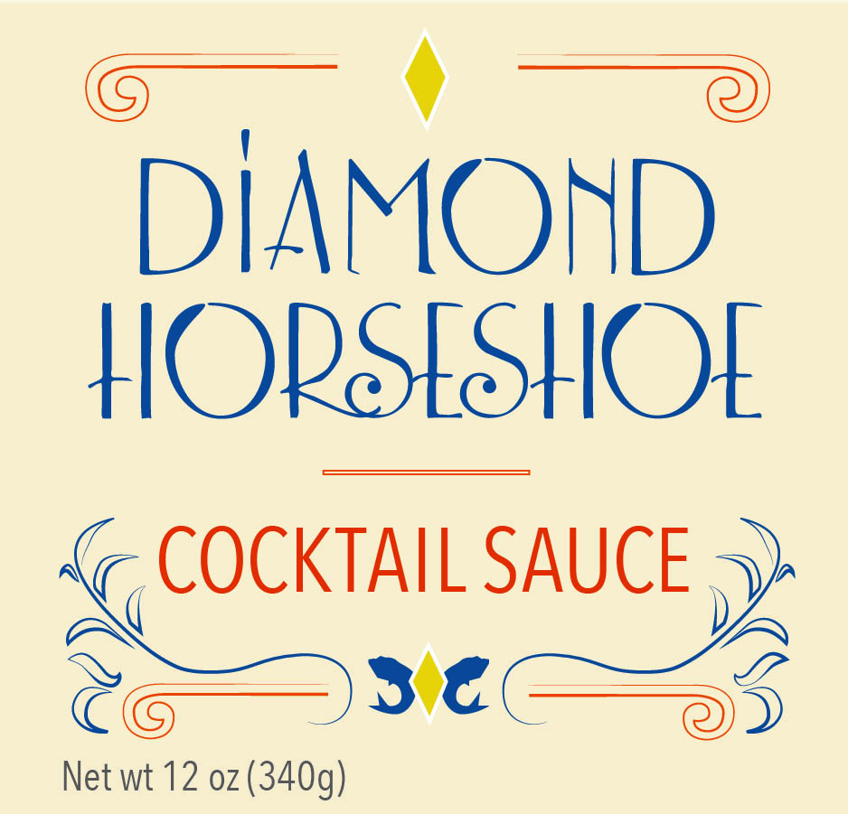
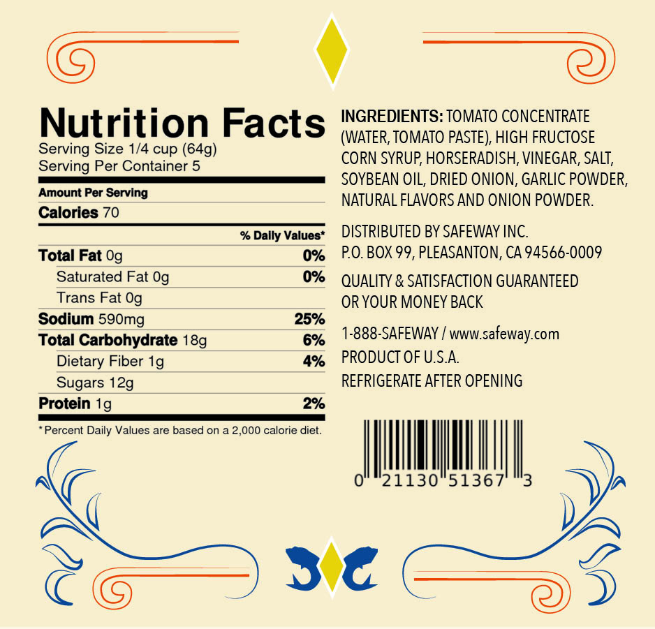
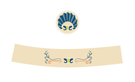
I had a lot of fun sketching for this concept; looking at art deco, movie posters, billboards and a lot of 1920-1940 signage.  I picked up the typeface “Lemon Chicken” for free on fontsquirrel and altered it to give it more of a vintage flair.  The flourishes, fish and diamond logo and shell seal are all hand-drawn.  The two bottom images are the seal for the lid of the bottle and the wrap label for the neck of the bottle.

Here are a couple of my final sketches:

Scan-label and lid Scan-neck label


And the finished product:

Label-front & back Label-front & back2


Label-Neck-and-Lid


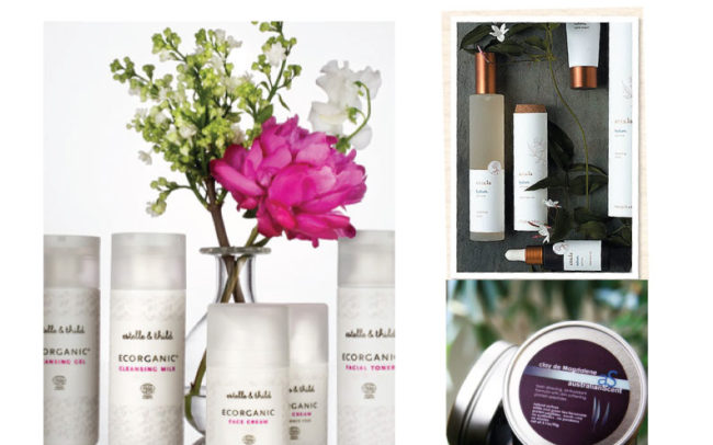
Tval Skincare Rebrand

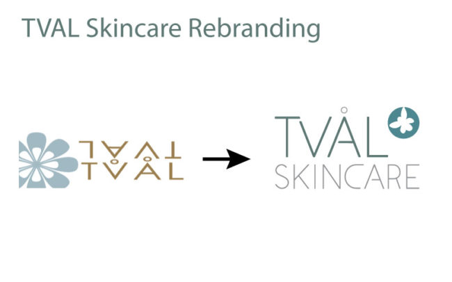
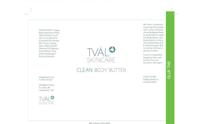
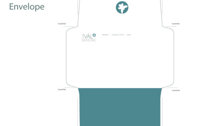
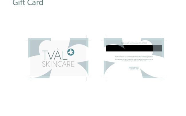
Our project for the quarter for our typography class was to perform a rebrand for a real company.  We had our choice of four different companies.  I chose Tval Skincare, an online skincare distributor based out of St. John’s, Newfoundland, Canada.

When I thought about St. John’s, Newfoundland, I thought of weather.  When the project was assigned, at the beginning of January, St. John’s had just been on the news for having “the storm of the century” — businesses and schools had been closed due to subzero temperatures and snow.  I was walking through the park on my way to my car after class, my umbrella buckling against the wind, battling a little Seattle version of an ice storm.  That got me thinking about protection from the elements.  After all, that’s what any skincare product’s primary function is: to protect you from the sun, UV rays, the wind, and the cold.  Then I thought — wait a second.  The owners and operators of the company, a husband and wife, both have PhDs in biology.  Then I thought of the periodic table of elements, and decided that my concept would be “Elements” as in, protection from the elements, as well as the periodic table, and the science behind the manufacturing their skincare products.

Logo

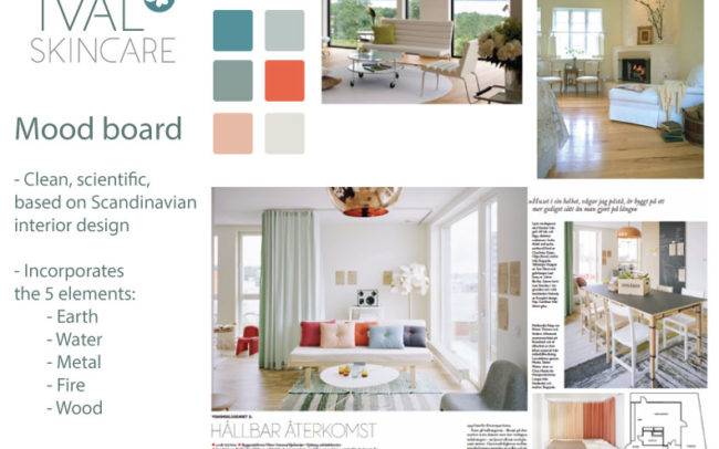
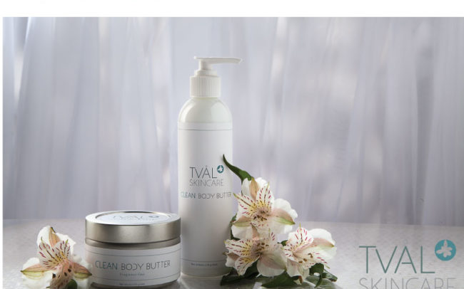
I made the custom typeface for the logo typeface and “Clean Body Butter” letters, and the “blossom” in the logo is a drawing I made of an atom, raised ‘to the power of’ the Tval Skincare name.  My mood board and concept incorporated the five elements: earth, water, metal, fire and wood.

A special thank you to Sean Balko, product photographer extraordinaire, for doing an amazing job of my promo photo.  I am still completely blown away with his finished product, not to mention his outstanding professionalism.  Even though he was doing me a tremendous favor, he treated this project with professionalism and integrity.  Thank you so much, Sean.  I owe you a big one!

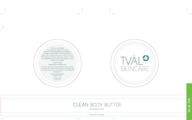
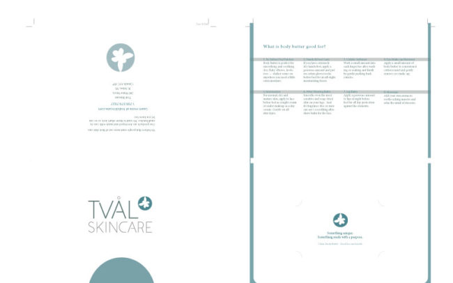
Here are my slides from my final presentation.


Markie Poppins!

Our final project for this quarter of New Media!  Dustin and I had so much fun making it!  Obviously a special thank you goes out to Marc Salverda, who was beyond accommodating in playing the role of Markie Poppins (we realized later that we would have to misspell his name for the title, otherwise it would look like Marcy).  In fact, I think Marc may have been having a little bit of fun, but don’t tell anyone 🙂

[youtube http://www.youtube.com/watch?v=WbsZIJa5cmU&w=560&h=315]


Things I Learned About Cat Massage

What was the most fun was showing it and making everyone laugh.  That was a very fun morning, because most groups came up with really funny concepts!  Everyone was laughing so hard our faces were hurting.  It was so cool to see what everyone came up with!!  My favorite was the cat massage lady!  I watch it whenever I’m feeling crappy and it makes me laugh every time.  So here ya go.  I hope you enjoy it as much as I do!

[vimeo http://www.vimeo.com/61667181 w=500&h=281]


Glyph Moth

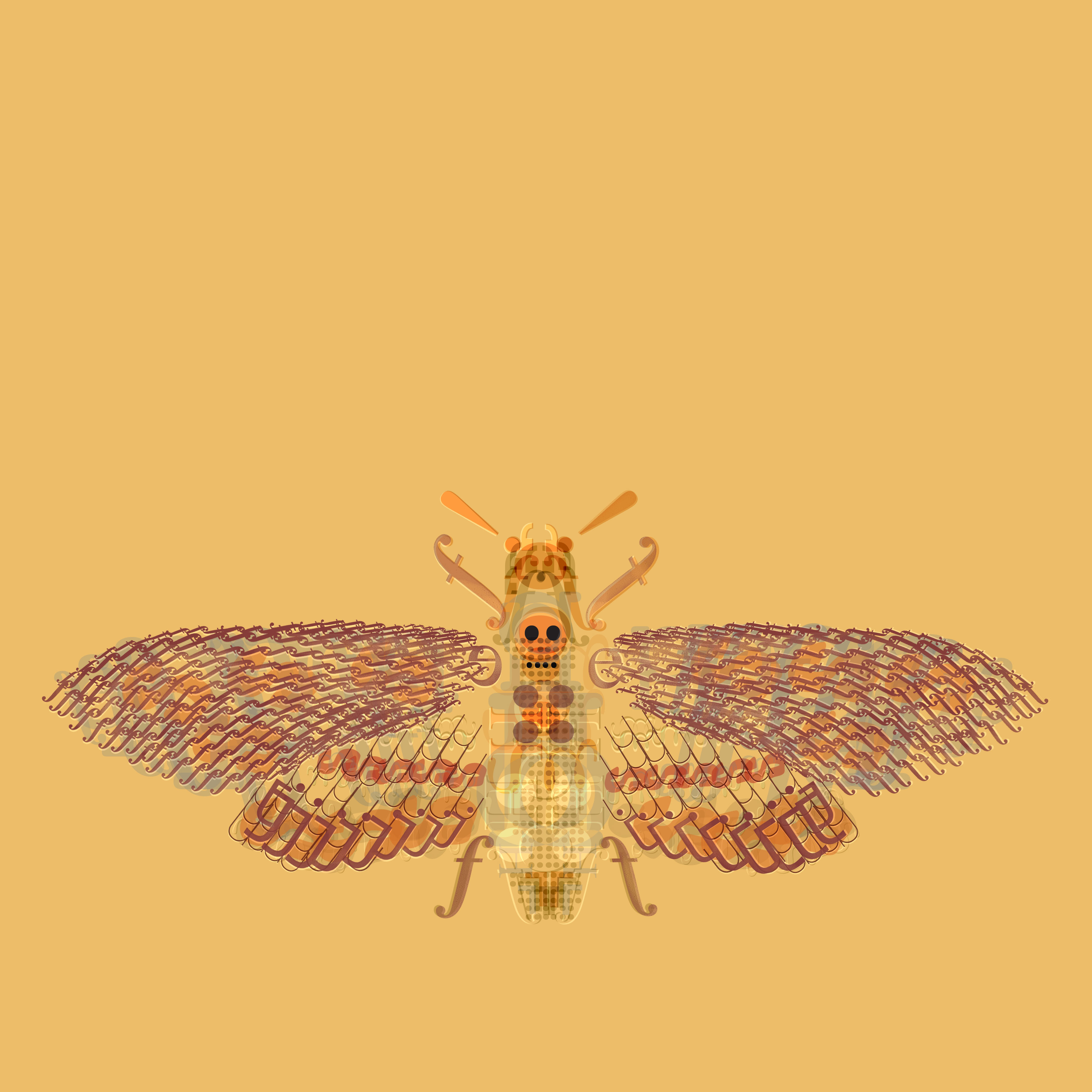
Last week our homework assignment was to construct something that occurs in nature out of 10 letters and glyphs that were provided by the teacher.  We were not to use anything other than the symbols provided, and were to use only blending modes in Photoshop to create a neat effect.  I totally shocked myself with how much I loved this — it reminded me a lot of my drawing process.  I had a lot of fun with this.  I had wanted to try and do something like Adam Gale does with the insects (I posted about him on here a few weeks ago), and now I want to try some more.  This was my first try and blending modes and I am really proud of the results.

Glyph Moth


House Project

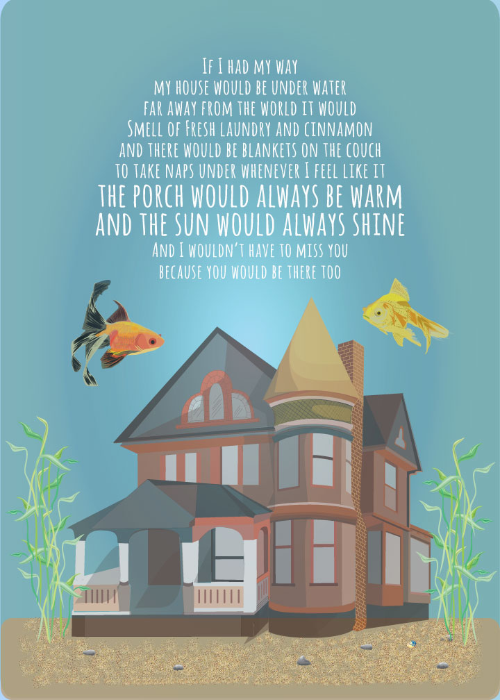
As one of our final color theory assignments we were tasked with creating a poster in Illustrator that depicted a house or any kind of dwelling of our choice.

Here’s mine!

House Project

This poster illustrates several color relationships.  The tetradic (double complementary) set of yellow, orange, blue and violet.  I used analogous relationships for the fish: yellow, yellow-orange and orange.  For the house, I used various tints and shades of the primary colors red, blue and yellow.

I used a muted color scheme and lots of shades and opacities to show highlights and shadows.  I used a radial gradient in the background to indicate the light source.

I worked on the words quite a bit.  I wanted to put something poetic on there, but couldn’t really come up with what I was looking for, so I opted for something still poetic but more childlike.  I feel like the typeface expresses the mood of the words well.


Blinkos Heist

This is the video we made for new media.  It was such a labor of love from beginning to end, and we had so much fun doing it.  Rachel and I made great writing partners and it was my acting debut.  I can’t wait to make another one!  So without further adieu, enjoy Blinkos Heist!

[youtube http://www.youtube.com/watch?v=l0vsRzWEVXY]


Best and Worst Superbowl Commercials

Yesterday during new media,we were tasked with finding the best and worst Superbowl commercials from this year and of all time.  Kevin Gangi, Kristen Conrad and I came up with the following results!

Best Ad of 2013:

Budweiser Clydesdale Commercial

[youtube=http://www.youtube.com/watch?v=o2prAccclXs]

I can’t watch this without crying.  Seriously.  I’m an emotional wreck.  If I watch this again I am going to have to book a counseling appointment.  The concept is friendship and camaraderie and it does a bang up job of tugging at those heartstrings.  The audience has a wide appeal.  Man or woman, if you don’t cry at this, you are actually a robot and not a human being.  It brings people together.  It reaches a huge audience, including children, which is great because we all know kids go nuts for Budweiser.  You and your significant other of any age can cuddle up under a throw blanket and watch this and cry into a super-absorbant paper towel together and you will never need marriage counseling again.  What more do you want?  The force is strong with this one.  In my books it won by, as the song says, a landslide.  (Get it?  Cause the song they played was Landslide?  Get it?  Booyah.)

Worst Ad of 2013:

Kia “Hotbots”

[youtube=http://www.youtube.com/watch?feature=player_embedded&v=QFuIP0HeiTA]

WHAT.  THE…… Now, I had a long list of worst ads this year, but what the hell was that?  I don’t understand what Kia was going for as far as concept is concerned.  I dunno, that if you kick the tire of their car you will be brutally assaulted?  Don’t people kick the tires of cars all the time?  I’m confused.  Was the underwear over the head thing supposed to be funny?  I don’t understand how this appeals to ANYONE of any age or gender.  Maybe space aliens might like it because that’s what robot women do on their planet.  Also, maybe 13-year-old boys.  Maybe it will encourage them to save their grass-trimming earnings and in a few years they could  buy their very own Kia.  Maybe.

Best Ads of all time

I had a lot of favorites, but I think these are my top three:

[youtube=http://www.youtube.com/watch?v=AcroQsUN60s]

[youtube=http://www.youtube.com/watch?v=NBCzT-CZ4mE]

[youtube=http://www.youtube.com/watch?v=xffOCZYX6F8]

I chose these ads as my favorites because after all these years I still remember them.  As a kid, I found these ads exciting, and they made me want to drink Coke and eat McDonalds and turn into a fat kid.  I also played basketball.  I still love McDonalds food.  The 90s were so great.

In my research of superbowl ads, two things that were common was slapstick humor and sentimentality.  I think companies commonly use these techniques because they appeal to a broader audience.  I’m not crazy about slapstick, I think it’s kinda stupid, but even I would laugh at some of the antics in spite of myself.  A lot of the ads that I viewed I thought were too violent, but I guess football is a violent sport, so there ya go.

I like how some people get their cheezies and their chips and dips ready just watch the half time show and the commercials.  That kinda cracks me up.  This is a terrific case where the ads have nearly equal importance as the show itself.  Ads, especially superbowl ads, are no longer just about the 30 seconds.  They are about giving the viewer an experience and companies finding unique ways to administer their message.  Pretty cool stuff.

And no blog posting would be complete without a little cat herding.

[youtube=http://www.youtube.com/watch?v=1SmgLtg1Izw]


Bugs are fucking gross.

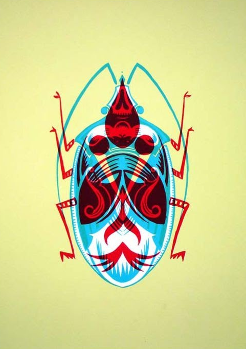
But these bugs are pretty cool.  Adam Gale does graphic illustrations of insects.

Adam Gale beetle


Check out and buy his work here:

https://www.artfinder.com/artist/adam-gale/?utm_source=facebook&utm_medium=post&utm_campaign=20130202-promo-graphicgale-fbook-post