GHF – Revised Style Tile & Logo Iterations

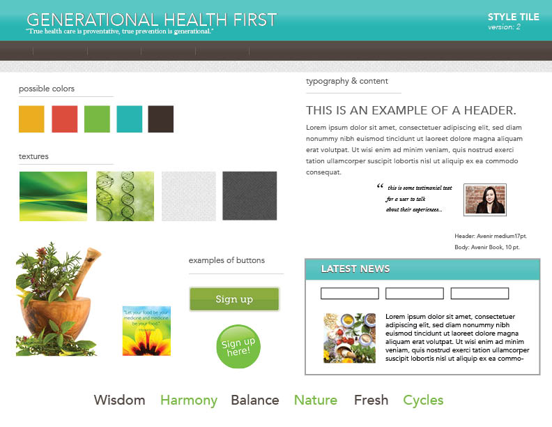
After my discussion with the client last week, I decided to refine the style tile to make it look a little more modern and fresh, and to incorporate some of the client’s wishes. Here’s version 2 of the style tile for Generational Health First. It is still very much a draft and a work in progress. I am just trying some different style approaches. I feel like it is going in a better direction.

GHF Style Tile-ver 2

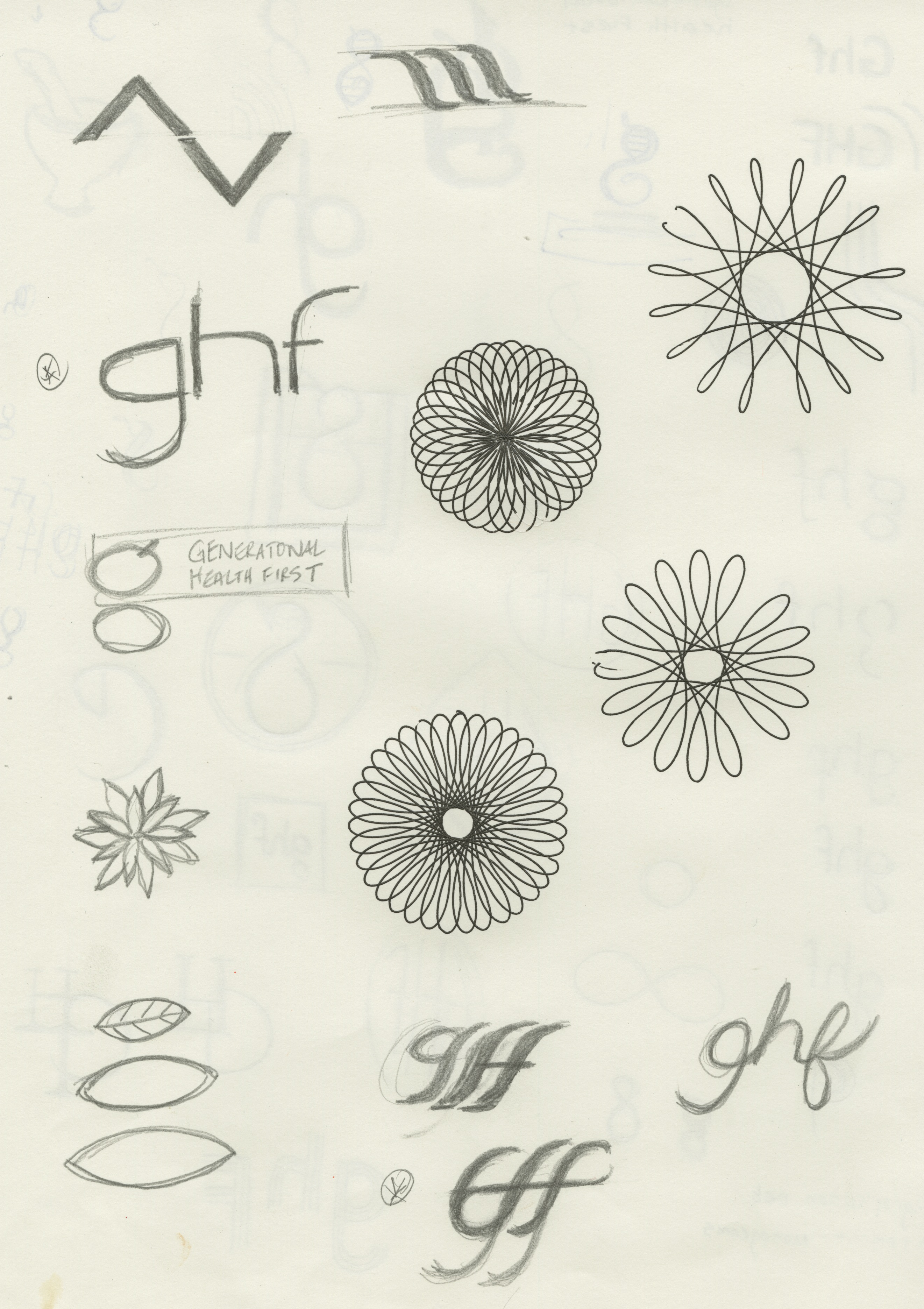
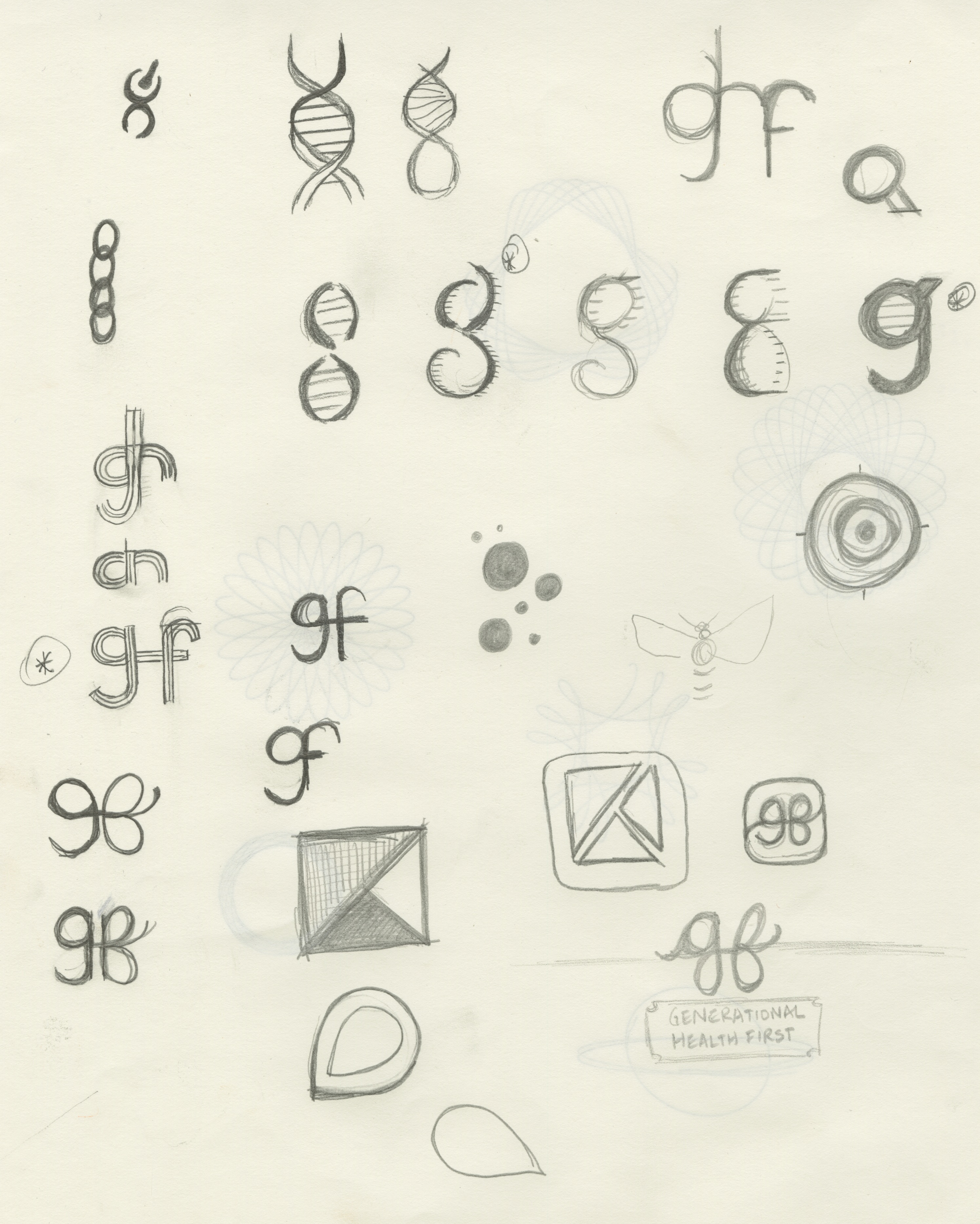
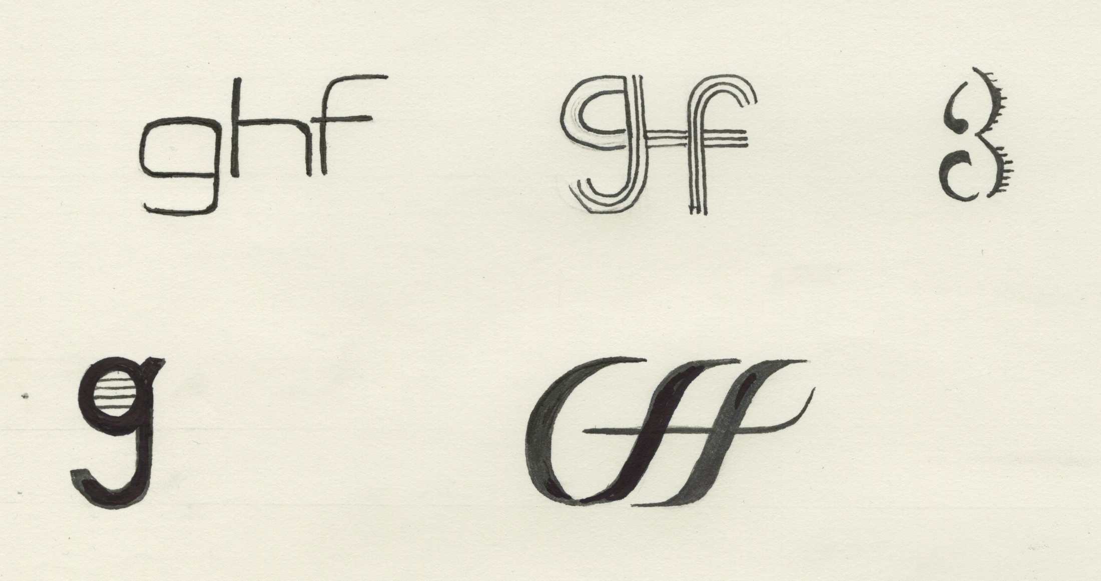
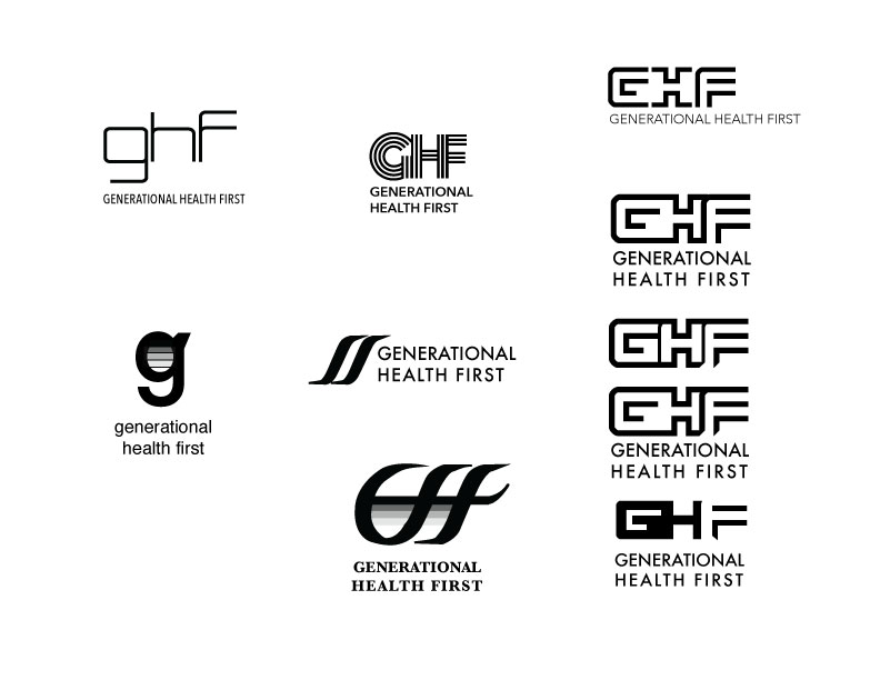
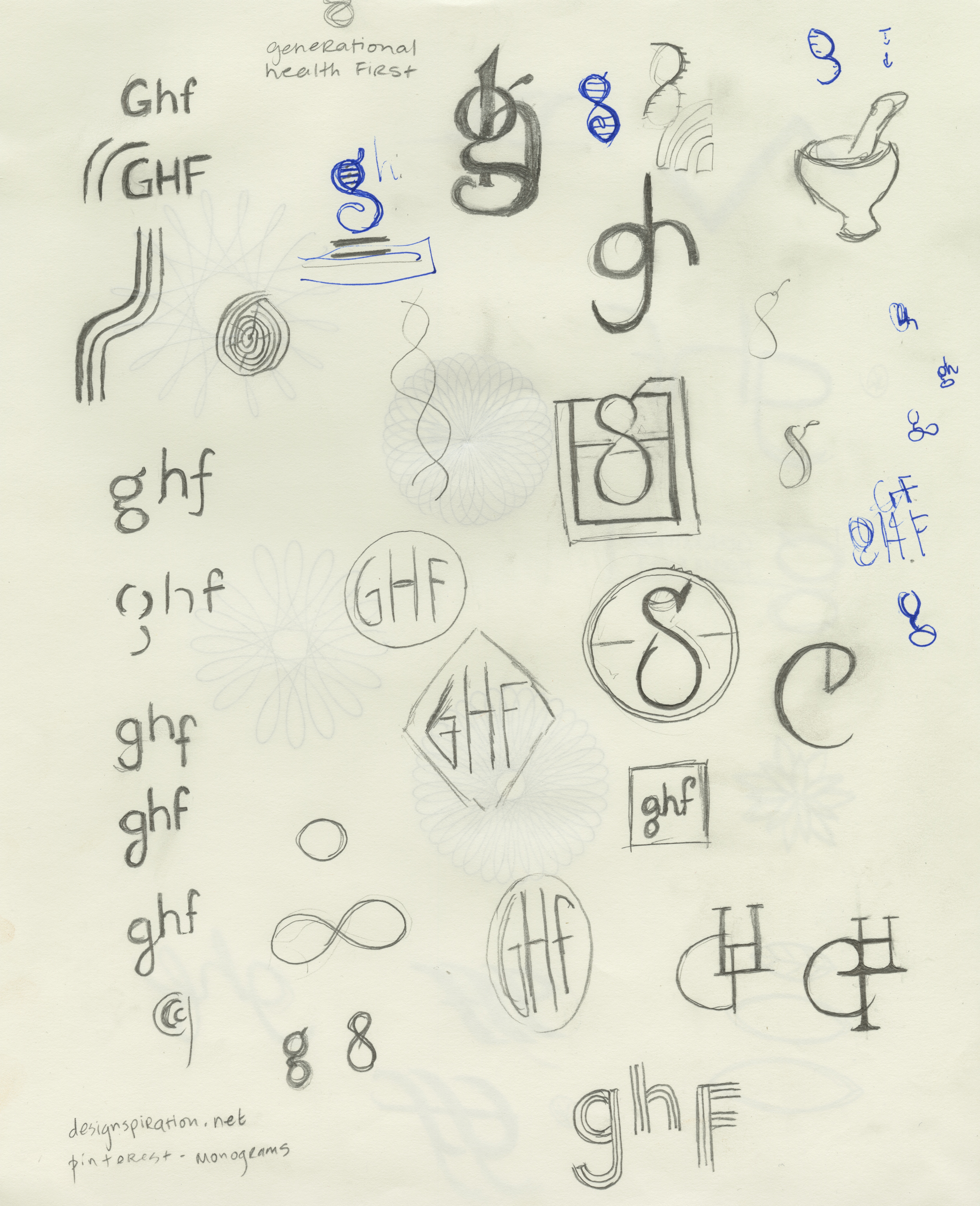
For the past week, I have been working on sketches for the GHF logo.  Here are some of my sketches and the electronic version of the initial drafts. I am expecting that the logo will go through many more iterations before we make a final decision.

GHF-sketches-1GHF-sketches-2GHF-sketches-3GHF-sketches-4

GHFlogos

I have another meeting with the client today, during which he will provide feedback on the updated style tile and logo ideas. I will proceed with finalizing the wireframes this week.

Generational Health First – week 2

As I mentioned last week, I am working on branding for my special projects assignment. I love branding and marketing, so I am very excited about this project. I have chosen to create a look and feel, brand, and WordPress site for a naturopathic doctor. He has written a book, which is in the editing stage now, but the client would like a book design and e-book in due course.

We signed the contract last week and I had my second client meeting last Friday. I realized last week after talking to Marc that I need to work on bringing more energy and confidence to these meetings. I basically need to learn to sell the client on my abilities as a designer, as they have hired me with zero prior knowledge of my skill set, and have some legitimate concerns about my abilities.

We made some good progress on what we like & don’t like about the initial style tile. This gave me a good insight on what the client is looking for from a style perspective and made me feel a lot better. The client is open to other typeface treatments for the logo and I will choose several for him to choose from. He has indicated that a non-typographic logo may not be necessary, but we may revisit this later. We agreed that the length of the title creates challenges from a design perspective, and discussed focusing on “GHF” for the logo instead.

This week, my deliverables will be to provide the client with some alternate typeface treatments for the logo. We discussed the wire frames and I explained some content strategy techniques, specifically, how to use blogging and guest blogs to keep the site active, and designing from the “content out”. Thankfully, we agree on all the suggestions I made, so I feel ready to get started on the site map and wireframing in the coming week.

I am taking an agile approach to this project, but am on target with the established timeline:

Sept 23 – 28 – Establishing / Pitching project idea

Sept 29 – Oct 5 – Establishing look and feel – brainstorming – color palette & style tile

Oct 6 – 12 – Logo development & Typography treatment

Oct 13 – 19 – Finalizing Logo and overall look and feel

Oct 20 – 26 – Sitemap & initial sketches (some existing wireframes already prepared by client)

Oct 27 – Nov 2 – Begin developing wireframes

Nov 3 – 9 – Finalize wireframes

Nov 10 – 16 – Begin uploading content to existing WordPress theme

Nov 17 – 23 – WordPress

Nov 24 – 30 – WordPress

Dec 1 – 7 – WordPress

Dec 8 – 14 – Finalize WordPress site


Special Projects Assignment

For my special projects assignment, I have chosen to work on branding and marketing for a start up company. It is a unique situation. A friend knows a naturopath who has written a book on health and wellness, and needs a WordPress.org site to promote the book. The client will need a typographic logo, overall look and feel, site map, wireframes and a WordPress site. The client has already purchased a domain and provided a theme, to use in the event that we do not have time to do a complete responsive WordPress redesign. Partial wireframes have been provided by the client for structure purposes.

Content is limited at this point. I suspect some marketing copywriting may be required, as well as weekly content for blog entries. The largest challenge I can anticipate with this project will be restructuring the content for the web. The client has indicated that he wants the website to act mainly as a squeeze page, but has also indicated that there is potential for a lot of content and his wireframes include a lot of header tabs.

Wikipedia, on squeeze pages:

A squeeze page is a single web page with the sole purpose of capturing information for follow-up marketing; that means NO exit hyperlinks. Quality squeeze pages use success stories that the prospect would relate to when making a buying decision. They also use things like color psychology, catchy sales copy and keyword rich text placed with SEO. Some advanced marketers even use audio and video on their squeeze page.

Internet marketers borrow copywriting techniques from offline direct response marketing. This includes the use of a headline, bullets, teaser copy, deadlines, testimonials, scarcity, and the like. Aggressive marketers will present visitors with multiple incentives in exchange for their contact information.

As a general rule, Internet marketers try to keep the content on their squeeze pages to a minimum. The goal of the page is to obtain the visitor’s email address; additional information could distract the user or cause them to “click away” to a different website. Navigation and hyperlinks are almost always absent from typical squeeze pages. The absence of links is used to focus visitors’ attention on one choice: register for the email list or leave the site. Savvy internet marketers have discovered that convincing a visitor to sign up for an email list provides an opportunity to present that visitor with multiple sales messages over time, develop a relationship, and even cross-sell other related products.

Squeeze pages are often used in conjunction with an email autoresponder to begin delivering information as soon as the visitor confirms their email address. The autoresponder may be utilized to send a series of follow-up emails or to provide an immediate download link to get information. Promising information upon completion of confirming their email address has proven to be an effective method of increasing opt-ins using squeeze pages.

New technology has also led to adding voice or video to squeeze pages in an effort to capture the visitor’s attention.

A contract has been prepared and sent to the client for review and completion.

I have completed the initial version of the style tile and am awaiting feedback from the client. The next step will be completing a site map and beginning the wire-framing process.

The research process has been the major focus of the first two weeks of the project, as I needed to read the first 10 chapters of the book and do research on internet marketing.

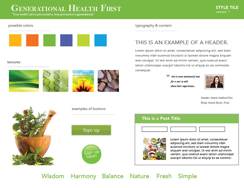
Style Tile

Version 1 of the style tile, using ideas sourced during first client meeting.