Fairer Than Death

Last Wednesday, we were given the following (terrific) design exercise. Give it a shot, it was a lot of fun!!

Today’s Graphic Design Exercise by Alex Griendling
It really is quite genius.
He says “I do these as experiments, and use the below formula. It doesn’t matter if the finished design is any good or not, only that I’m challenging myself to think on the fly, and develop an interesting solution to the problem presented.”

Here are the rules:

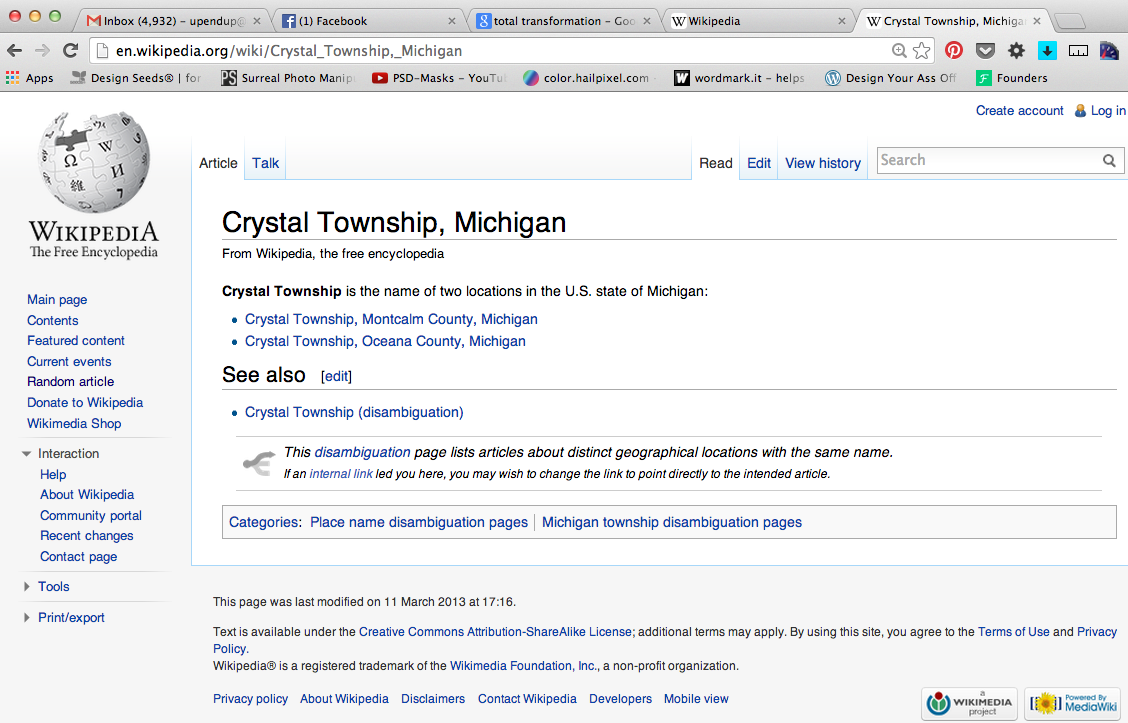
1 – Go to “wikipedia.” Hit “random” or click
en.wikipedia.org/wiki/Special:Random
The first random wikipedia article you get is the name of your band.

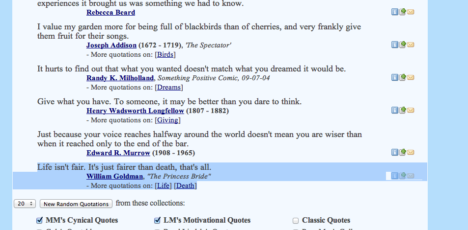
2 – Go to “Random quotations” or click
www.quotationspage.com/random.php3
The last four or five words of the very last quote of the page is the title of your first album.

3 – Go to flickr and click on “explore the last seven days” or click
www.flickr.com/explore/interesting/7days
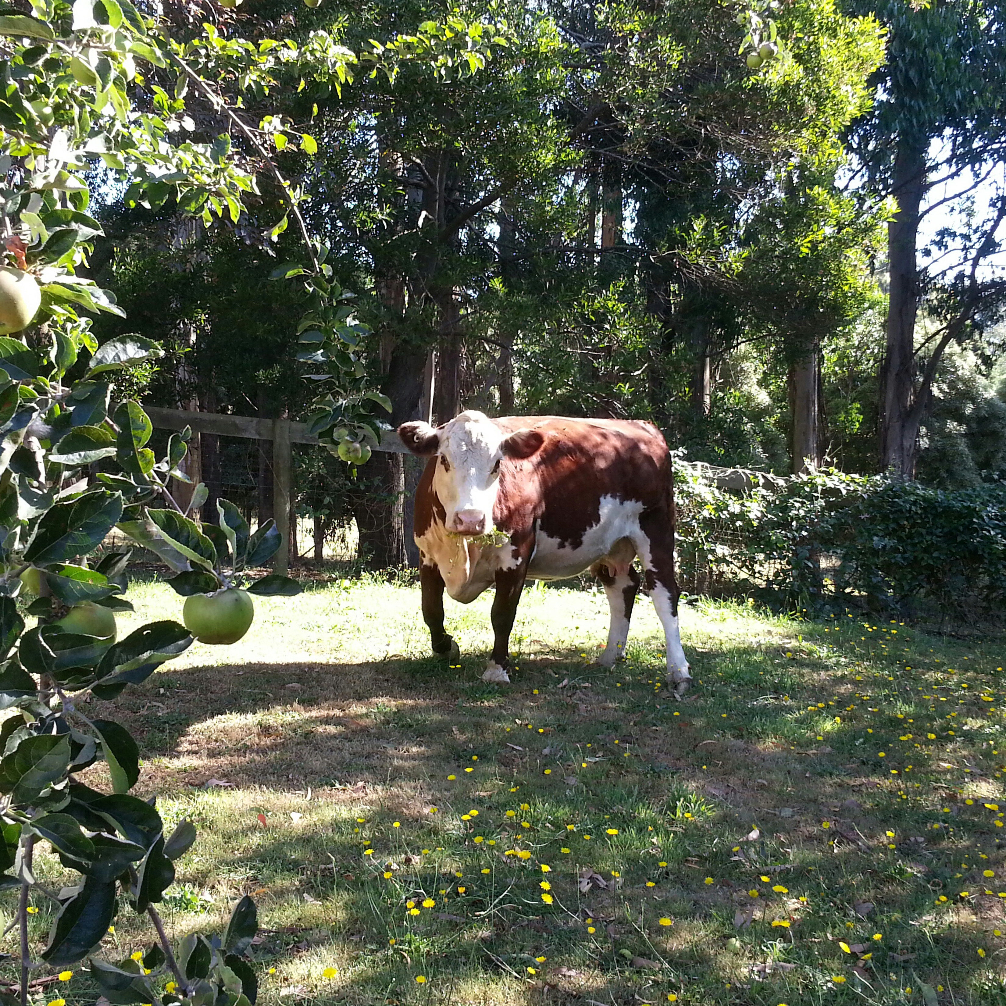
Third picture, no matter what it is, will be your album cover.

4 – Use photoshop or similar to put it all together. Your finished piece should be 11″ X 11″ trimmed and put on the white board.

You have one hour…..ready, set, GO.

*****

My random article was about Crystal Township, Michigan, and my random quotation was

“Life isn’t fair. It’s just fairer than death, that’s all.”
from the Princess Bride.

For the picture, I chose a photo of a cow from flickr.

Screen Shot 2014-02-05 at 11.36.14 AM Screen Shot 2014-02-05 at 11.38.56 AMFairer_than_death


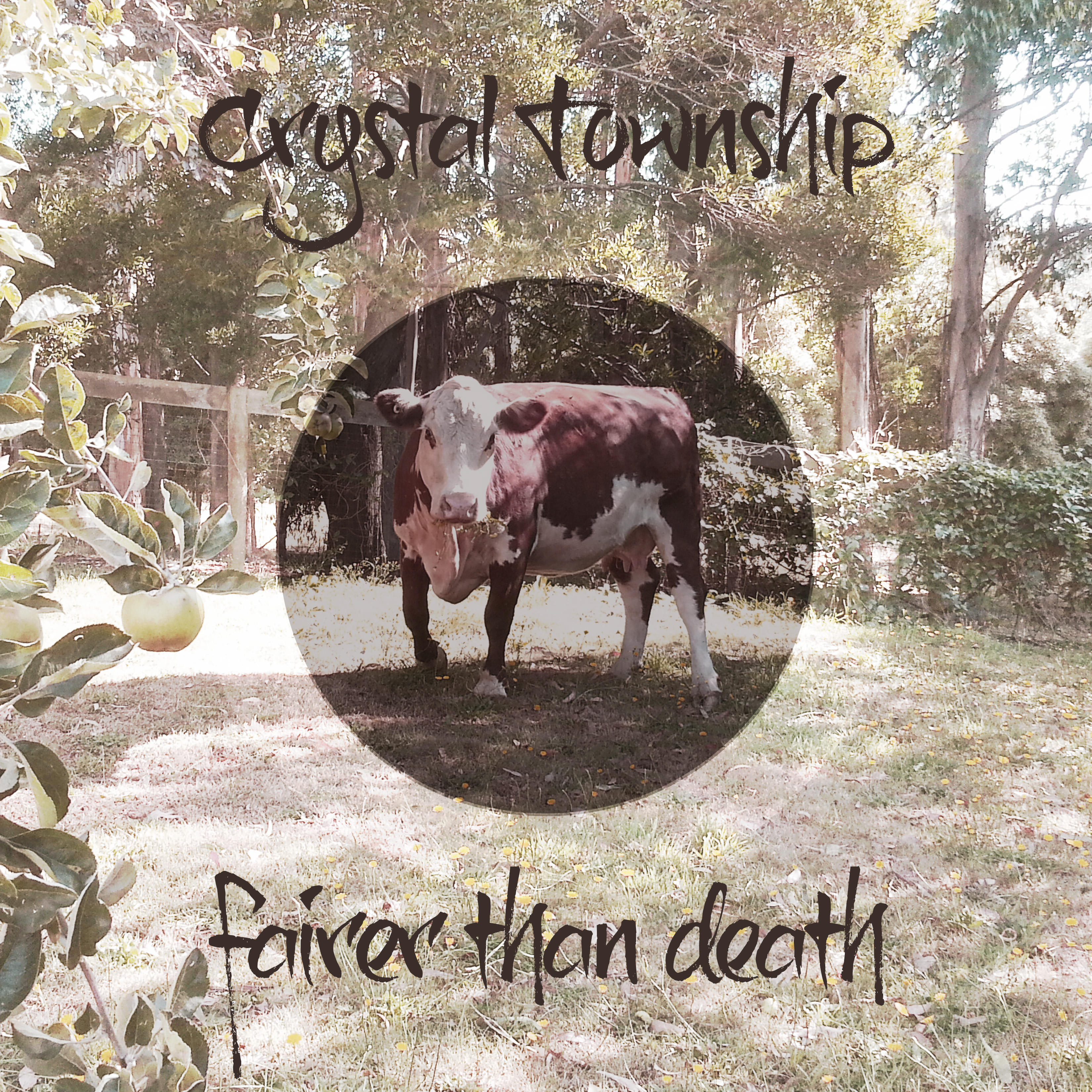
And here’s my album cover! It was so much fun to make!

Fairer_than_death


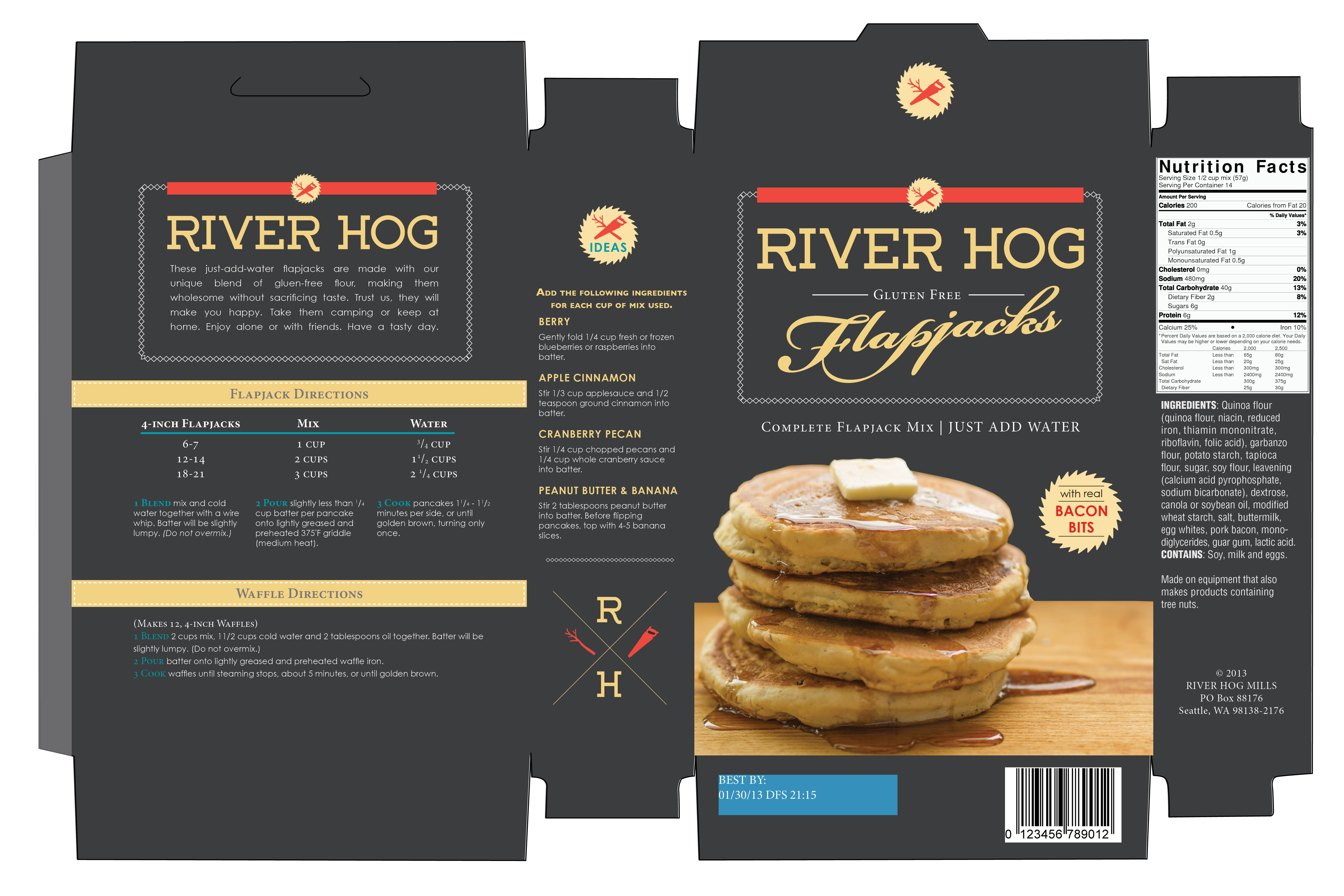
River Hog Flapjacks

Introducing River Hog Flapjacks!  This has been the most fun part of my school experience so far — this making up of companies. For my second package design assignment, I decided to do a pancake mix. In Canada, sometimes a pancake breakfast is called a “lumberjack breakfast”, and so I decided to incorporate a lumberjack concept. In my research, I found that “river hog” is a term for loggers that use river water to transport wood, and I thought that sounded like a great name. I wanted to design something hip and sophisticated, something unique that would stand apart from the competitors on the grocery shelves. I opted for a dark color for the box and a modern typeface combined with a more old-fashioned looking script typeface. I even cooked the pancakes and took the photo myself! This was my first time photographing food for a label, and I have to say I was pretty impressed with the results. Thanks to my teacher Tom who challenged me to find the button on my computer that makes things look good.

River_Hog_Flapjacks_Box


Diamond Horseshoe Cocktail Sauce

Our first task for our package design class was to pick a jar or round container and come up with a product name.  I chose cocktail sauce, because I knew it would be challenging.  In my research for my creative brief, I discovered that the American version of cocktail sauce was invented during prohibition and it is suggested that cocktail dishes (shrimp cocktail, fruit cocktail, etc.) were invented as a creative way to make use of unused stemware. For my concept, I decided upon 1930s supper clubs, which was the birthplace of cocktail sauce.

And so gave birth to Diamond Horseshoe Cocktail Sauce, named after a well-known supper club of the 1930s.

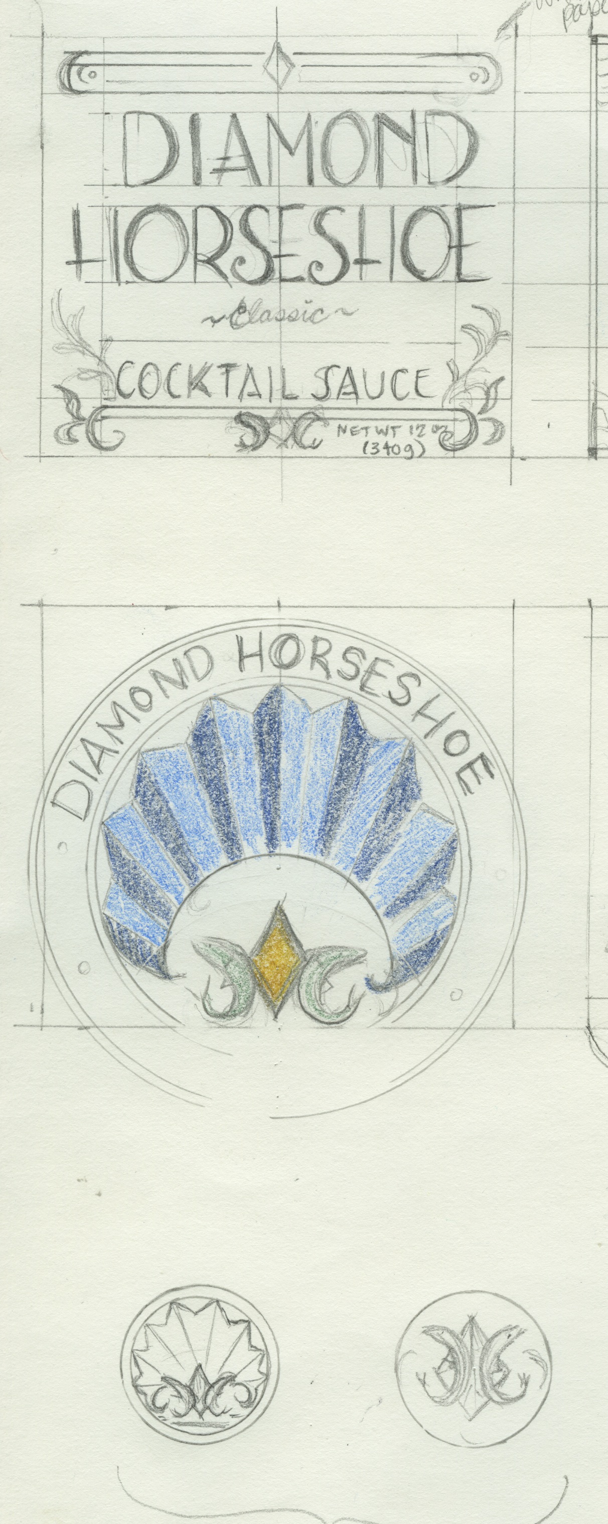
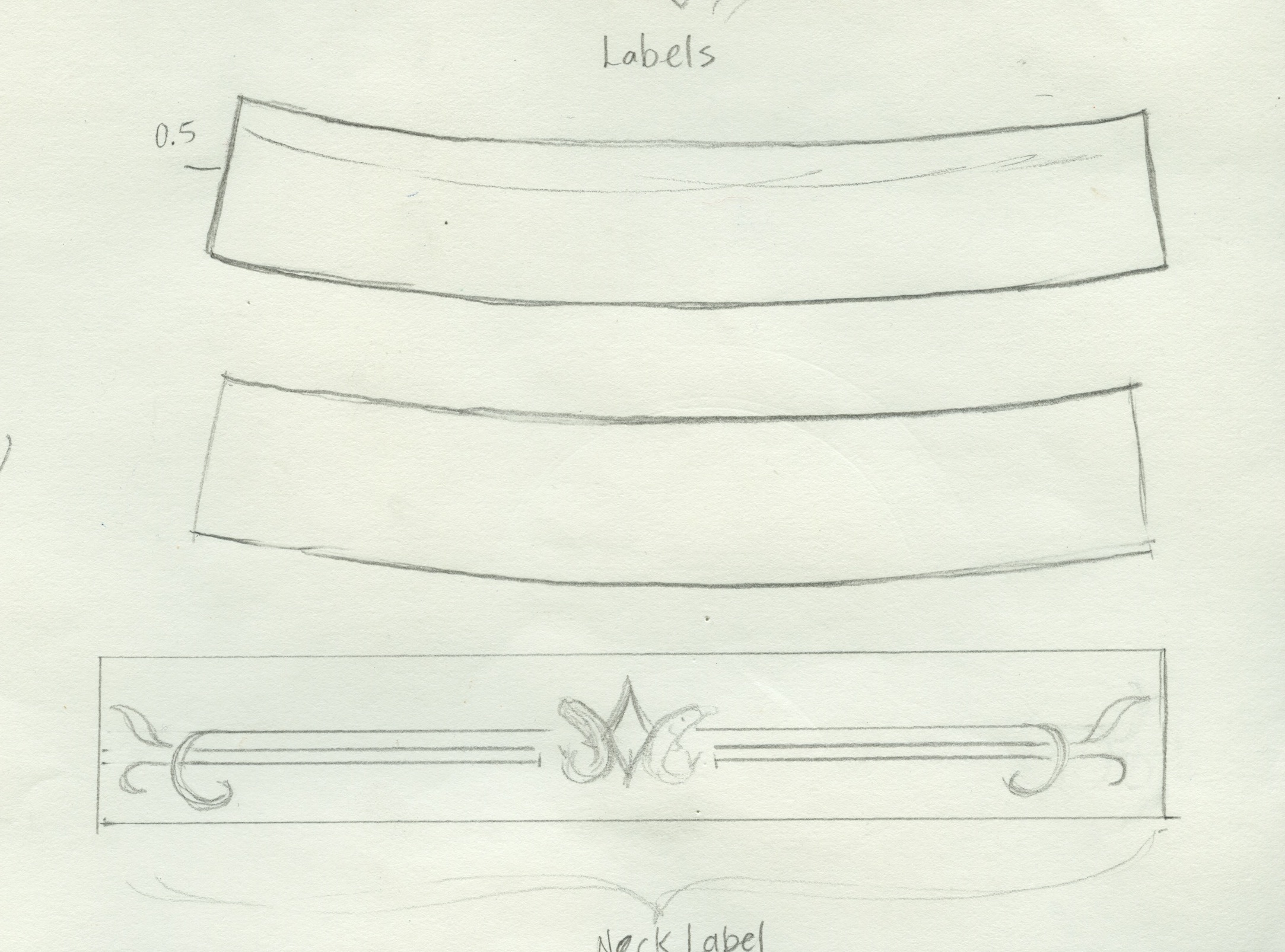
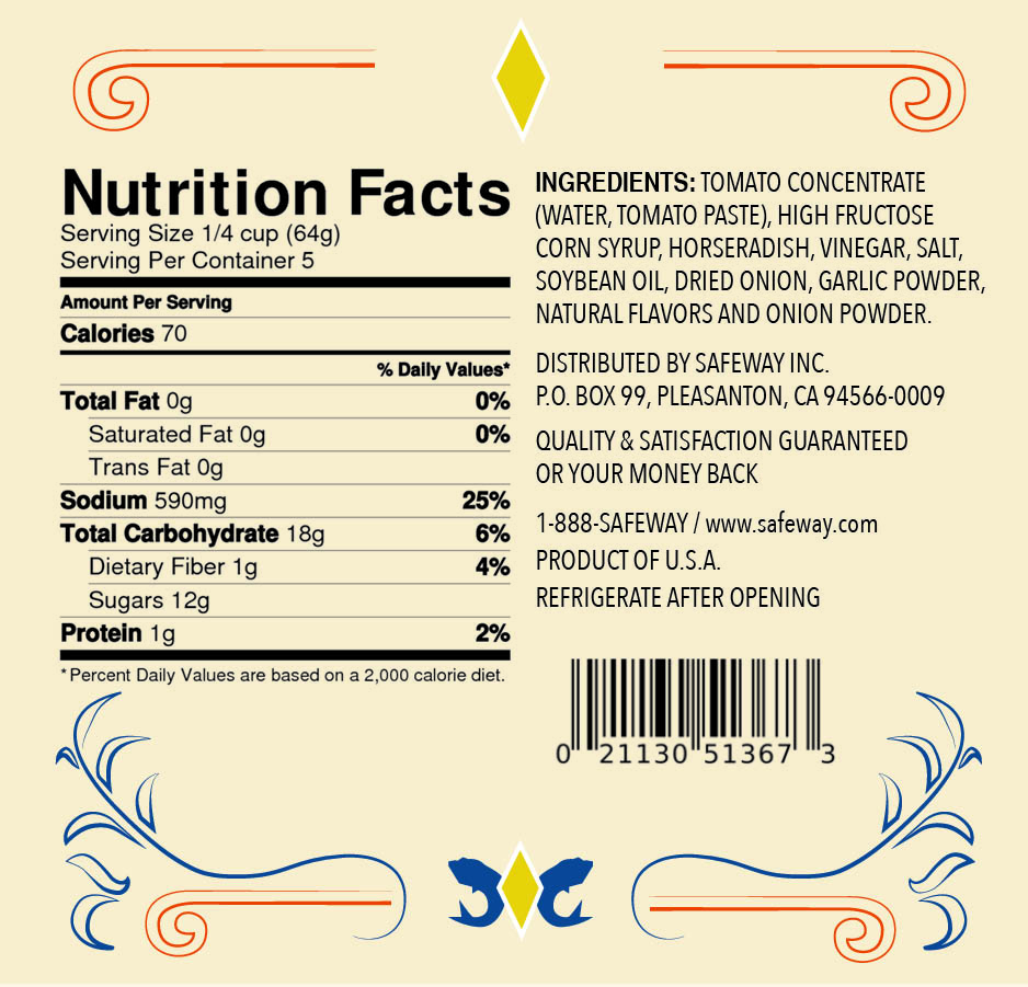
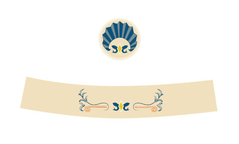
I had a lot of fun sketching for this concept; looking at art deco, movie posters, billboards and a lot of 1920-1940 signage.  I picked up the typeface “Lemon Chicken” for free on fontsquirrel and altered it to give it more of a vintage flair.  The flourishes, fish and diamond logo and shell seal are all hand-drawn.  The two bottom images are the seal for the lid of the bottle and the wrap label for the neck of the bottle.

Here are a couple of my final sketches:

Scan-label and lid Scan-neck label


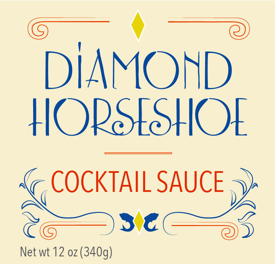
And the finished product:

Label-front & back Label-front & back2


Label-Neck-and-Lid


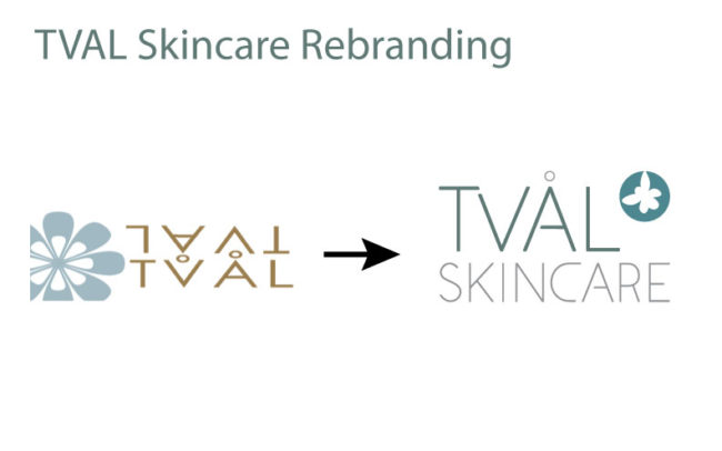
Tval Skincare Rebrand

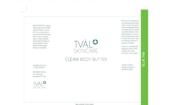
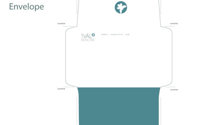
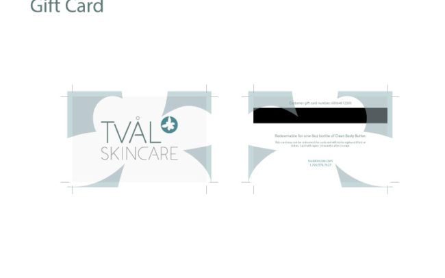
Our project for the quarter for our typography class was to perform a rebrand for a real company.  We had our choice of four different companies.  I chose Tval Skincare, an online skincare distributor based out of St. John’s, Newfoundland, Canada.

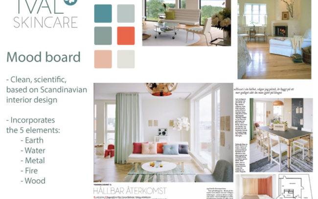
When I thought about St. John’s, Newfoundland, I thought of weather.  When the project was assigned, at the beginning of January, St. John’s had just been on the news for having “the storm of the century” — businesses and schools had been closed due to subzero temperatures and snow.  I was walking through the park on my way to my car after class, my umbrella buckling against the wind, battling a little Seattle version of an ice storm.  That got me thinking about protection from the elements.  After all, that’s what any skincare product’s primary function is: to protect you from the sun, UV rays, the wind, and the cold.  Then I thought — wait a second.  The owners and operators of the company, a husband and wife, both have PhDs in biology.  Then I thought of the periodic table of elements, and decided that my concept would be “Elements” as in, protection from the elements, as well as the periodic table, and the science behind the manufacturing their skincare products.

Logo

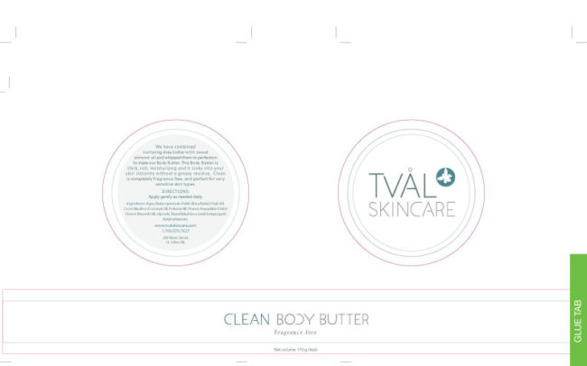
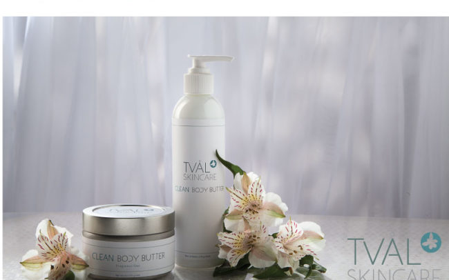
I made the custom typeface for the logo typeface and “Clean Body Butter” letters, and the “blossom” in the logo is a drawing I made of an atom, raised ‘to the power of’ the Tval Skincare name.  My mood board and concept incorporated the five elements: earth, water, metal, fire and wood.

A special thank you to Sean Balko, product photographer extraordinaire, for doing an amazing job of my promo photo.  I am still completely blown away with his finished product, not to mention his outstanding professionalism.  Even though he was doing me a tremendous favor, he treated this project with professionalism and integrity.  Thank you so much, Sean.  I owe you a big one!

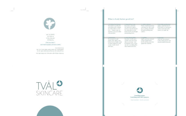
Here are my slides from my final presentation.